Where people in prison come from:
The geography of mass incarceration in Virginia
by Emily Widra and Kenneth Gilliam
July 2022
Press release
One of the most important criminal legal system disparities in Virginia has long been difficult to decipher: Which communities throughout the state do incarcerated people come from? Anyone who lives in or works within heavily policed and incarcerated communities intuitively knows that certain neighborhoods disproportionately experience incarceration. But data have never been available to quantify how many people from each community are imprisoned with any real precision.1
But now, thanks to redistricting reform that ensures incarcerated people are counted correctly in the legislative districts they come from, we can understand the geography of incarceration in Virginia. Virginia is one of eleven states that have formally ended prison gerrymandering (while another three states have addressed the practice through their state redistricting commissions), and now count incarcerated people where they legally reside — at their home address — rather than in remote prison cells. This type of reform, as we often discuss, is crucial for ending the siphoning of political power from disproportionately Black and Latino communities, to pad out the mostly rural, predominantly white regions where prisons are located.2 And when reforms like Virginia’s are implemented, they bring along a convenient side effect: In order to correctly represent each community’s population counts, states must collect detailed state-wide data on where imprisoned people call home, which is otherwise impossible to access.
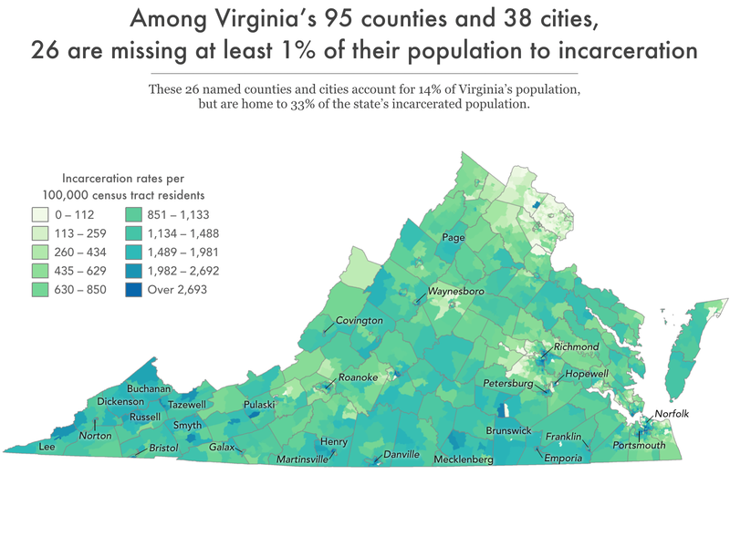
Using this redistricting data, we found that in Virginia, some of the state’s largest cities — Norfolk and Richmond — are sending the highest numbers of people to prison, but it is smaller cities — like Martinsville, Petersburg, Franklin — and less populous counties — including Buchanan, Lee, Dickenson, and Brunswick counties — that are missing a larger share of their population to incarceration.3 And a deeper dive into the data shows that even within cities there are dramatic differences in rates of incarceration between neighborhoods, often along racial and socioeconomic lines. These data show that — big or small — every community in Virginia is harmed by mass incarceration.
In addition to helping policy makers and advocates effectively bring reentry and diversion resources to these communities, this data has far-reaching implications. Around the country, high incarceration rates are correlated with other community problems related to poverty, employment, education, and health. Researchers, scholars, advocates, and politicians can use the data in this report to advocate for bringing more resources to their communities.
Incarcerated people come from all over Virginia — but disproportionately from some places more than others
County trends
Most broadly, we find that incarcerated people in Virginia come from every corner of the state: every single one of the state’s 95 counties is missing a portion of its population to incarceration. Residence data shows that some of the least populous counties — like Buchanan, Brunswick, Lee, and Dickinson counties — have the highest county incarceration rates. These four counties have less than 25,000 residents, but have startling high incarceration rates averaging 1,175 per 100,000 (or an average of 209 county residents incarcerated). The rates in these counties are even more striking when compared to the state’s most populous county — Fairfax — with an incarceration rate of 80 per 100,000 and the statewide incarceration rate of 485 per 100,000.4 The high incarceration rates in these less populous counties suggests the idea that incarceration is a problem uniquely experienced in cities is a myth.
City trends
While rural communities are impacted by incarceration, it is clear that many of Virginia’s cities5 have the highest incarceration rates in the state, especially the smaller cities with fewer than 100,000 residents. The ten cities with highest incarceration rates are home to less than 3% of the statewide population, but are home to more than 6% of incarcerated Virginians. For example, Martinsville has a population of less than 14,000 people, but has the highest incarceration rate in the state with 1,787 people in prison per 100,000 city residents (or 243 incarcerated city residents).
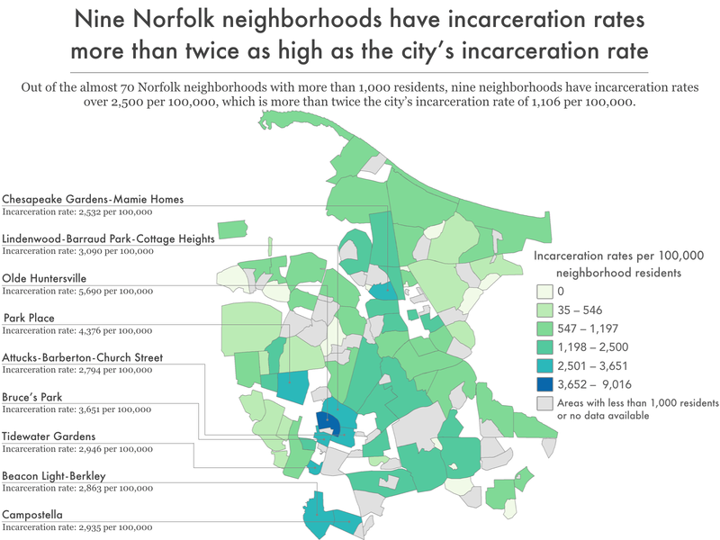
Residence data for Virginia’s four most populous cities — with populations over 200,000 residents — show an interesting trend across the state. The two most populous cities — Virginia Beach and Chesapeake — actually do not incarcerate the most people. Virginia Beach has 1,823 incarcerated residents, for an incarceration rate of 396 per 100,000 residents and Chesapeake has 1,516 incarcerated residents, for an incarceration rate of 611 per 100,000. Norfolk and Richmond, on the other hand, have smaller citywide populations but actually incarcerate more people. Norfolk has 2,653 incarcerated residents and an incarceration rate of 1,106 per 100,000 residents, while Richmond has 2,496 incarcerated residents and an incarceration rate of 1,092 per 100,000.
We know that policing and criminalization tends to target poor communities and people of color, and this is likely part of why Martinsville, Richmond, and Norfolk — cities with higher portions of Black residents and more of the population living in poverty — are facing such high incarceration rates compared to cities of similar sizes in Virginia that are more white and wealthy, like Virginia Beach and Chesapeake.
Neighborhood trends
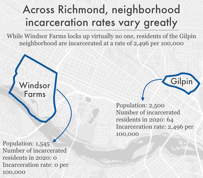
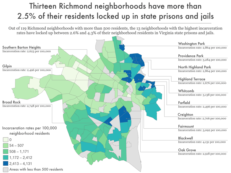
The Windsor Farms neighborhood — historically considered one of the “best” neighborhoods for real estate investment during redlining — tends to be predominately white and imprisons virtually no one. Across the city, the neighborhood of Gilpin imprisons residents at a rate of 2,496 per 100,000. Gilpin was considered one of the most “hazardous” areas during redlining, and remains a predominantly Black neighborhood.
Among localities with populations of at least 200,000, Richmond is considered one of the most racially segregated cities in the nation. And research has shown that policing tends to target poor communities and neighborhoods composed of people of color, in particular, Black people. This is true in Richmond, where the city’s population is 46% Black, but Black people make up 78% of the city’s arrests and are more than three times more likely to be arrested for low-level offenses than non-Hispanic white Richmond residents.6 While we do not have arrest or incarceration rates by income level, we do know that Richmond residents tend to be poorer than the rest of the state: 21% of Richmond city residents live in poverty, compared to 9.2% of Virginia residents living in poverty. Compared to other similar-sized Virginia cities like Virginia Beach, Norfolk, and Chesapeake, Richmond has the highest portion of the city population living in poverty and evidence suggests that poverty is highly concentrated in Richmond’s Black neighborhoods.
With this in mind, it is not surprising to find that incarceration rates also tend to follow neighborhood divisions. Approximately 96% of Richmond residents live in a neighborhood that is missing at least one person to prison or jail, but the incarceration rates range widely between neighborhoods.
More than half of everyone incarcerated from Richmond, for example, come from just 22 of the city’s more than 140 neighborhoods. All of those high-incarceration neighborhoods are located in the southern and northeastern parts of the city, leaving the central and western parts of the city with fewer people incarcerated and with lower incarceration rates.
Historically, Richmond is one of the starkest examples of redlining in the country. In the 1930s, the federal government rated the “riskiness” of real estate investment in different neighborhoods, resulting in rating non-white neighborhoods as “hazardous” and beginning a cycle of disinvestment in these predominately Black and immigrant neighborhoods. A 2019 study of formerly redlined neighborhoods in over 100 cities found that these neighborhoods are lower-income and are more likely to be home to Black and Hispanic or Latino residents. The neighborhoods with the highest incarceration rates in 2020 are also the neighborhoods that were “redlined” in the mid-20th century. Decades of systematic oppression and divestment from these poorer communities of color — which we know are overpoliced — have left these historically redlined communities particularly vulnerable to Virginia’s modern-day reliance on mass incarceration.
While all communities are missing some of their members to incarceration, in places where large numbers of adults — parents, workers, voters — are locked up, incarceration has a broader community impact. The large number of adults drained from a relatively small number of geographical areas seriously impacts the health and stability of the families and communities left behind.7
What are the differences between high- and low-incarceration communities?
Across the country, researchers have connected high local incarceration rates with a host of negative outcomes for the people who live there. In a 2015 Prison Policy Initiative analysis of where incarcerated people in Maryland are from, we found that Baltimore communities with high rates of incarceration were more likely to have high unemployment rates, long average commute times, low household income, a high percentage of residents with less than a high school diploma or GED, decreased life expectancy, high rates of vacant or abandoned properties, and higher rates of children with elevated blood-lead levels, compared to neighborhoods less impacted by incarceration. Such results are strictly correlational, suggesting that communities that are heavily affected by incarceration are simultaneously facing a host of other challenges and systemic disadvantages that combine to make almost every aspect of life difficult. These geographic disparities are not an accident, but are the result of long-standing racist policies and decisions about where to invest resources.
Across the country, research reveals the numerous correlations8 between imprisonment and other consequences of underinvestment in community wellbeing:
- Life expectancy: A 2021 analysis of New York State census tracts found that tracts with the highest incarceration rates had an average life expectancy more than two years shorter than tracts with the lowest incarceration rates, even when controlling for other population differences.9 And a 2019 analysis of counties across the country revealed that higher levels of incarceration are associated with both higher morbidity (poor or fair health) and mortality (shortened life expectancy).
- Community health: A nationwide study, published in 2019, found that rates of incarceration were associated with a more than 50% increase in drug-related deaths from county to county. And a 2018 study found that Black people living in Atlanta neighborhoods with high incarceration rates are more likely to have poor cardiometabolic health profiles.
An analysis of North Carolina data from 1995 to 2002 revealed that counties with increased incarceration rates had higher rates of both teenage pregnancy and sexually transmitted infections (STIs). A 2015 study of Atlanta also found that census tracts with higher rates of incarceration had higher rates of newly diagnosed STIs.10 - Mental health: A 2015 study found that people living in Detroit neighborhoods with high prison admission rates were more likely to be screened as having a current or lifetime major depressive disorder and generalized anxiety disorder.
- Exposure to environmental dangers: A 2021 study found that people who grew up in U.S. census tracts with higher levels of traffic-related air pollution and housing-derived lead risk were more likely to be incarcerated as adults, even when controlling for other factors.
In New York City, neighborhood incarceration rate is associated with asthma prevalence among adults. Similarly, in our 2020 analysis of New York City neighborhoods, we found higher rates of asthma among children in communities with high incarceration rates.11 - Education: In a 2020 Prison Policy Initiative analysis of incarcerated New Yorkers’ neighborhoods of origin, we found a strong correlation between neighborhood imprisonment rates and standardized test scores.12 And a 2017 report on incarceration in Worcester, Mass., found that schools in the city’s high-incarceration neighborhoods tended to be lower-performing. What’s more, students in those neighborhoods faced more disciplinary infractions.
- Community resources and engagement: A 2018 study found that throughout the country, formerly incarcerated people (as well as all people who have been arrested or convicted of a crime) are more likely than their non-justice-involved counterparts to live in a census tract with low access to healthy food retailers. And the 2017 report on Worcester, Massachusetts, revealed that high-incarceration neighborhoods had lower voter turnout in municipal elections.
We already have this wealth of data showing that incarceration rates correlate with a variety of barriers and negative outcomes. The data in this report build on this work by helping identify which specific neighborhoods throughout Virginia are systematically disadvantaged and left behind. Virginia residents can use the data in this report to examine granular local-level and state-wide correlations and choose to allocate needed resources to places hardest hit by incarceration.
Implications & uses of these data
These 10 data tables provided here have great potential for community advocacy and future research.
First and most obviously, these data can be used to determine the best locations for community-based programs that help prevent involvement with the criminal legal system, such as offices of neighborhood safety and mental health response teams that work independently from police departments. The data can also help guide reentry services (which are typically provided by nonprofit community organizations) to areas of Virginia that need them most.
But even beyond the obvious need for reentry services and other programs to prevent criminal legal system involvement, our findings also point to geographic areas that deserve greater investment in programs and services that indirectly prevent criminal legal involvement or mitigate the harm of incarceration. After all, decades of research show that imprisonment leads to cascading collateral consequences, both for individuals and their loved ones. When large numbers of people disappear from a community, their absences are felt in countless ways. They leave behind loved ones, including children, who experience trauma, emotional distress, and financial strain. Simultaneously, the large numbers of people returning to these communities (since the vast majority of incarcerated people do return home) face a host of reentry challenges and collateral consequences of incarceration, including difficulty finding employment and a lack of housing. People impacted by the criminal legal system tend to have extremely diminished wealth accumulation. And those returning from prison and jail may carry back to their communities PTSD and other mental health issues from the trauma they’ve experienced and witnessed behind bars. Lastly, investing in core community resources to mitigate structural issues like poverty, such as housing and healthcare, will reduce vulnerabilities for criminal legal system contact.
And since we know place of origin correlates with so many other metrics of wellbeing, we can and should target these communities for support and resources beyond what we typically think of as interventions to prevent criminal legal system contact. In communities where the state or city has heavily invested in policing and incarceration (i.e. the high-incarceration neighborhoods we find in our analysis), our findings suggest that those resources would be better put toward reducing poverty and improving local health, education, and employment opportunities.
For example, we know that large numbers of children in high incarceration areas may be growing up with the trauma and lost resources that come along with having an incarcerated parent, and that these children are also more likely to experience incarceration. The information in this report can help with planning and targeting supports, resources, and programming designed to not only respond to the harms caused by incarceration, but disrupt the cycle of familial incarceration.
We invite community organizers, service providers, policymakers, and researchers to use the data tables made available in this report to make further connections between mass incarceration and various outcomes, to better understand the impact of incarceration on their communities.
Methodology & data
This report capitalizes on the unique opportunity presented by Virginia’s ending of prison gerrymandering, which allows us to determine accurately for the first time where incarcerated people incarcerated come from. In this report’s linked datasets, we aggregate these data by a number of useful state-wide geographies such as counties, state legislative districts, congressional districts, and for some city-wide geographies such as neighborhoods in the cities of Chesapeake and Richmond.
This section of the report discusses how we processed the data, some important context and limitations on that data, and some additional context about the geographies we have chosen to include in this report and appendices. The goal of this report is not to have the final word on the geographic concentration of incarceration, but to empower researchers and advocates — both inside and outside of the field of criminal justice research — to use our dataset for their own purposes. For example, if you are an expert on a particular kind of social disadvantage and have some data organized by county, zip code, state legislative district, or other breakdown and want to add incarceration data to your dataset, we probably have exactly what you need in a prepared appendix described below.
This report and its data are one in a series of similar reports we are releasing in the spring and summer of 2022, focusing on 13 states — California, Colorado, Connecticut, Delaware, Maryland, Montana, Nevada, New Jersey, New York, Pennsylvania, Rhode Island, Virginia, and Washington — which counted incarcerated people at home for redistricting purposes, and therefore also made this analysis possible. This report can also be seen as a template for other states because while not all states have ended prison gerrymandering, most state departments of corrections already have near-complete home residence records in an electronic format. States that have not yet ended prison gerrymandering should be encouraged to continue improving their data collection, and to share the data (under appropriate privacy protections) so that similar analyses could be performed.
How we processed the data
Virginia’s law ending prison gerrymandering required the Department of Corrections and State Board of Local and Regional Jails to share the home addresses of people in state prisons and local and regional jails on Census Day 2020 with the Division of Legislative Services, so that these officials could remove imprisoned people from the redistricting populations reported by the Census for the facilities’ locations and properly credit people to their home communities. The adjusted data was then made available for state and local officials to use to draw new legislative boundaries. As a side effect, this groundbreaking dataset allows researchers to talk in detail for the first time about where incarcerated people came from.
Creating the tables in this report required several steps which were expertly performed by Peter Horton at Redistricting Data Hub:
- Downloading Virginia’s adjusted redistricting data, which contains the state’s entire population, with the people incarcerated in state prisons reallocated to their home addresses.
- Subtracting the state’s redistricting data from the original Census Bureau P.L. 94-171 redistricting data, to produce a file that represented the number of incarcerated people the state determined were from each census block state-wide. (Census blocks that showed a net gain of population following the reallocation were the Census blocks that incarcerated people were reallocated to, and the amount of that change was the number of people from that block who were incarcerated in a state prison on Census day. For a different analysis that focused on both the net gains and net decreases in individual census blocks and then aggregated to counties and the final redistricting plans, see Peter Horton’s report for Redistricting Data Hub on Virginia.
- Aggregating these block-level counts of incarcerated people to each of the geography types available in the report. In cases where a census block containing an incarcerated person’s home address straddles the boundary between two geographies, the incarcerated population was applied to the geography that contained the largest portion of the census block’s area.
- Calculating imprisonment rates for each geography, by first calculating a corrected population that shows the Census 2020 population plus the number of incarcerated people from that geography; and then dividing the number of incarcerated people by the corrected total population, and then multiplied it by 100,000 to get an imprisonment rate per 100,000.
Important context and limitations on this data
Our analysis in this report documents the home addresses of 41,855 people in state prisons and local jails, which is somewhat less than the state’s combined prison and jail population of 47,463 on Census day.13 These numbers are different for a variety of reasons, including policy choices made when the legislation ending prison gerrymandering was created and others are just the practical outcome of valiant state efforts to improve federal census data, or the process of repurposing that dataset for this entirely different project.
From the perspective of improving democracy in Virginia, the state’s reallocation efforts were a success, reducing both the unearned enhancement of political representation in prison-hosting areas and reducing the dilution of representation in the highest-incarceration districts. From the perspective of using that data to discuss the concentration of incarceration, some readers may want to be aware of some the reasons why our report discusses the home addresses of 41,855 people when they may be aware that the state prison system and the local jail systems had a combined 47,463 people on Census day:
- Some people in Virginia prisons are from other states and therefore were not reallocated to homes in Virginia.
- Some addresses were unknown or could not be located for the reallocation. For example, an address on file may be incomplete or may contain only the notation “homeless” which of course cannot be applied to a specific home census block.
- Anyone whose home address by coincidence happens to be in a census block that contains a correctional facility would have been properly reallocated for purposes of ending prison gerrymandering, but their presence at that location would not, because of how we created our dataset, be apparent in this report.
Similarly, this report doesn’t reflect the other groups of people incarcerated from particular communities who are not reflected in these data,14 because they were:
- Incarcerated in a federal prison, because states do not have the power to require home address data from federal agencies. The Virginia legislation requires the state to request this data from the federal Bureau of Prisons, but it appears that the Bureau of Prisons did not share this data.
- Incarcerated in another state’s prison system. States cannot require other states to share this information, and the fact that so many states are ending prison gerrymandering is too new of a phenomenon for them to have had the chance to enter into inter-state data sharing agreements.
- Incarcerated in a local jail, in this state or elsewhere; because the state’s effort to remedy prison gerrymandering was focused on state prisons.
About the geographies
We’ve organized the data in this report around several popular geographies, as defined by the federal government, by the state, or by individual cities, with the idea that the reader can link our data to the wealth of existing social indicator data already available from other sources.
Unfortunately, the reader may desire data for a specific geography that we have not made available — for example, their own neighborhood, as they conceive of its boundaries. Often, there was not a readily accessible and official map that we could use that defined that boundary; so where the reader has this need, we urge the reader to look for other geographies in our datasets that can be easily adapted to their needs, either one that is similar enough to their preferred geography or by aggregating several smaller geographies together to match your preferred geography.
We also want to caution subsequent users of this data that some geographies change frequently and others change rarely, so they should note the vintage of the maps we used to produce each table. For example, county boundaries change very rarely, and when they do, it is often in extremely small ways. On the other hand, state legislative districts in some areas may change frequently and significantly, so depending on your goals some specific tables may be more or less applicable for your future use.
Finally, readers should note that occasionally the incarcerated numbers in our tables for some geographies will not sum precisely to the total 41,855 home addresses used in this report. That discrepancy arises because of how census blocks — the basic building block of legislative districts — nest or fail to nest within geographies drawn by agencies other than the Census Bureau.
Footnotes
Criminal legal system data is often poorly tracked, meaning researchers must cobble together information from different sources. But by using complete data from state redistricting committees, this report (and a series of other state reports that the Prison Policy Initiative developed with state partners) are uniquely comprehensive and up-to-date. The series includes two previous reports on Maryland (published in 2015, in collaboration with the Justice Policy Institute) and New York (published in 2020, in collaboration with VOCAL-NY), and our newest reports on California, Colorado, Connecticut, Delaware, Maryland, Montana, Nevada, New Jersey, New York, Pennsylvania, and Washington.
While these reports are the first to use redistricting data to provide detailed, local-level data on where incarcerated people come from statewide, other organizations have previously published reports that focused on individual cities or that provided data across fewer types of geographic areas. For example, the Justice Mapping Center had a project that showed residence data for people admitted to or released from state prisons in a given year for almost two dozen states. That project made those states’ annual admission and release data available at the zip code and census tract levels, most recently mapping 2008-2010 data. Separately, it also mapped the residences of people admitted to state prisons from New York City down to the block level using 2009 data.
Another resource (particularly helpful for states that are not included in our series of reports) is Vera Institute for Justice’s Incarceration Trends project, which maps prison incarceration rates for 40 states at the county level, based on county of commitment (meaning where individuals were convicted and committed to serve a sentence, which is often but not necessarily where they lived). ↩This visual explainer from the Virginia Public Access Project (VPAP) displays what the end of prison gerrymandering looks like in terms of transferring political clout from rural, primarily white areas with prisons to the more racially diverse — and more populous — cities. ↩
Incarceration rates per 100,000 are a useful tool for comparison between different geographic regions with varying population sizes. For example, using a rate per 100,000 allows us to compare the frequency of incarceration between the most populous Virginia county with over one million residents — Fairfax — with much less populous counties like Buchanan County, with just over 20,000 residents. ↩
As explained in the methodology, this report’s incarceration rate is based on the number of people in state prison and local jails who were reallocated to individual communities as part of the state’s law ending prison gerrymandering. This number is necessary for making apples-to-apples comparisons of incarceration between specific communities and the state as a whole. (This report and analysis of local incarceration rates are not comparable to the analyses of other states’ reports in this series because Virginia — unlike most other states we looked at — included jail populations in their reallocation efforts, while other states focused only on state prison populations.) For the purposes of comparing state-level incarceration in Virginia with that of other states, other more common metrics would be more useful. For these other uses, we would recommend using other numbers for the statewide incarceration rate, likely either the 370 per 100,000 published by the Bureau of Justice Statistics in Prisoners in 2020 for the number of people in state prison per 100,000 residents, or our more holistic number of 749 per 100,000 residents used in States of Incarceration: The Global Context 2021 that includes people in state prisons, federal prisons, local jails, youth confinement, and all other forms of incarceration. ↩
Virginia has 95 counties and 38 county-equivalent cities. These 38 independent cities are considered “county-equivalents” for Census purposes because they have the same level of government as counties. However, for the purposes of our analysis of Census residence data, we are considering these 38 independent cities as “cities” and the 95 counties as “counties” in order to make more logical comparisons across regions of the state. ↩
In this analysis from the Police Scorecard Project, “low-level” offenses are typically classified as misdemeanors and include the following types of offenses: drug offenses, public drunkenness and other alcohol-related offenses; vagrancy, loitering, gambling, disorderly conduct, prostitution, vandalism, and “other minor non-violent offenses.” ↩
These impacts of incarceration on families and communities include higher rates of disease and infant mortality, housing instability, and financial burdens related to having an incarcerated loved one. For more detailed information on how incarceration impacts families and communities, see On life support: Public health in the age of mass incarceration from the Vera Institute of Justice. ↩
These various correlative findings are once again in line with previous research on health disparities across communities, which have been linked to neighborhood factors such as income inequality, exposure to violence, and environmental hazards that disproportionately affect communities of color. Public health experts consider community-level factors such as these — including incarceration — “social determinants of health.” To counteract these problems, they suggest taking a broad approach, addressing the “upstream” economic and social disparities through policy reforms, as well as by increasing access to services and supports, such as improving access to clinical health care. ↩
We also know that people who have been incarcerated have a shorter life expectancy than people who have not. ↩
There are many additional studies linking incarceration rates and high community rates of STIs, including gonorrhea and chlamydia in North Carolina. ↩
Asthma prevalence has been used as a tool to measure population health in both sociological and public health research because it is easily correlated with environmental factors, like air quality and triggers (i.e. second hand smoke, mold, dust, cockroaches, dust mites), access to appropriate healthcare, and healthcare literacy. See the American Lung Association’s Public Policy Position for a literature review of the relevant public health research. ↩
Again, this finding is consistent with previous research on the relationship between education and imprisonment rates. We previously reported that the high school educations of over half of all formerly incarcerated people were cut short. This is in line with earlier studies showing that people in prison have markedly lower educational attainment, literacy, and numeracy than the general public, and are more likely to have learning disabilities. We also know there are relationships between parental incarceration and educational performance. ↩
According to a March 2020 report from the Virginia Department of Corrections, there were 25,505 people in state prison facilities, and based on our analysis of the 2020 Census data, there were another 21,958 people in Virginia jails on Census day, resulting in a total of 47,463 people in Virginia correctional facilities on Census day 2020. ↩
This list of groups of people who could not be counted at home is yet another set of reasons why the U.S. Census Bureau is the ideal agency to end prison gerrymandering: they are the only party with the ability to provide a complete solution and they can do this work far more efficiently than the states can. ↩
Acknowledgments
We would like to thank the Redistricting Data Hub, particularly Peter Horton, for providing valuable technical expertise and the key data in the appendix tables. Redistricting Data Hub’s assistance processing the redistricting data and connecting us with other demographic data enabled us to produce and distribute these reports faster and more affordably than would otherwise have been possible.
About the organizations
The non-profit, non-partisan Prison Policy Initiative produces cutting-edge research that exposes the broader harm of mass criminalization and sparks advocacy campaigns that create a more just society. In 2002, the organization launched the national movement against prison gerrymandering with the publication of Importing Constituents: Prisoners and Political Clout in New York. This report demonstrated how using Census Bureau counts of incarcerated people as residents of the prison location dilutes the votes of state residents who do not live next to prisons, in violation of the state constitutional definition of residence. Since then, Virginia is one of over a dozen states that have used Prison Policy Initiative’s research to end prison gerrymandering.
New Virginia Majority works to create a powerful multi-issue, multi-racial, movement to transform Virginia through large-scale civic engagement, issue advocacy, community organizing, and strategic communications. NVM organizes within Latinx, African American, Asian American Pacific Islander and youth communities, centering the leadership and demands of working-class women of color. Together, we vote, mobilize, and engage to end mass incarceration, build just economic policies, protect immigrant communities, and preserve the environment.
